5 Effective YouTube Thumbnail Tips to Captivate New Fans
.png)
In a world full of so much digital content, choosing what to watch next is often a split-second decision. Clear and attention-grabbing thumbnails can be all it takes for a music artist to attract new listeners and fans on YouTube and social media.
Below, Opposition’s Channel Growth and Marketing experts have listed the best YouTube thumbnail strategies practiced by Opposition’s roster of talent. Learn from artists who are moving the needle with their thumbnail strategies.
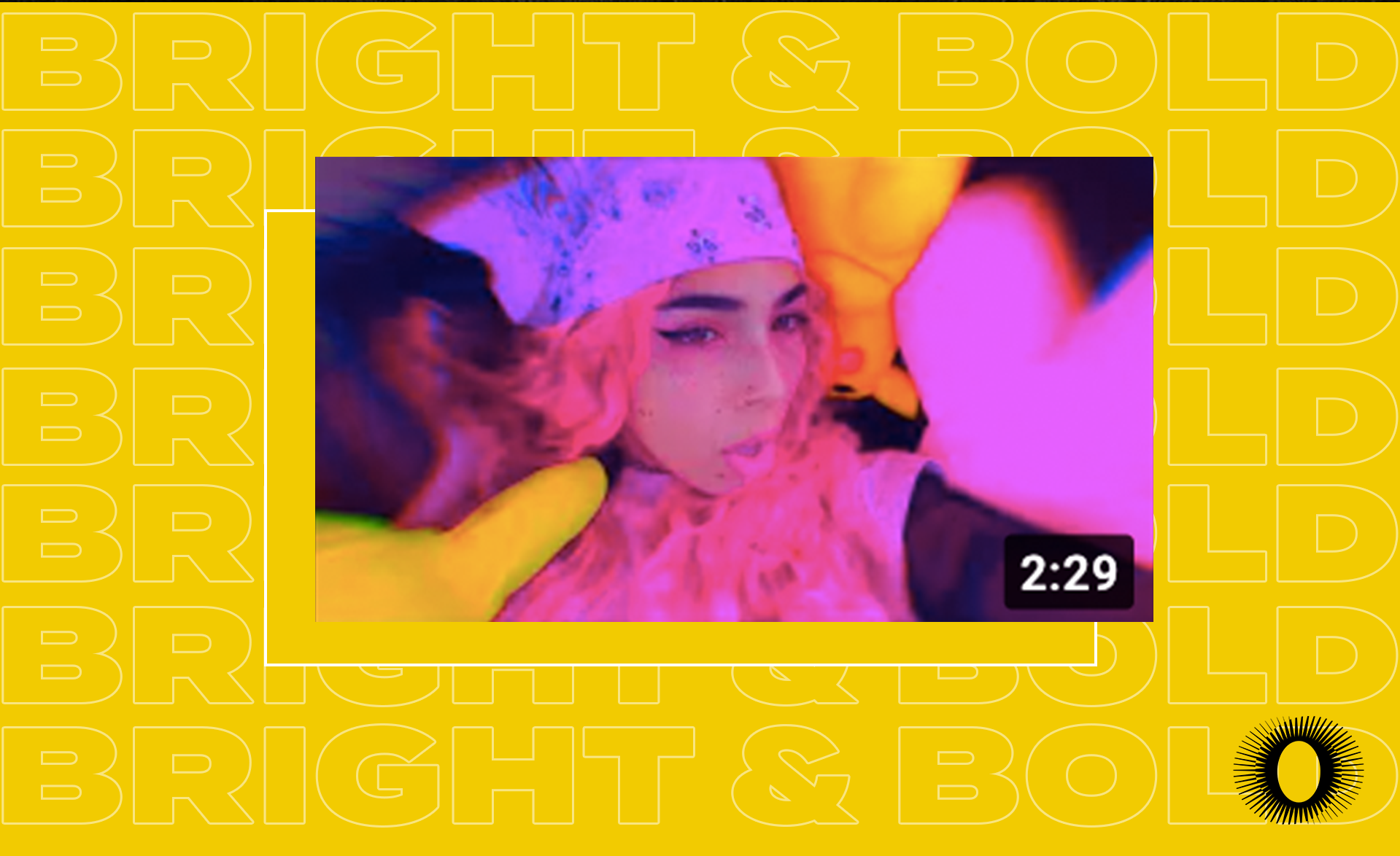
1. Keep YouTube Thumbnails Bold & Bright
Consider increasing the contrast, vibrance, and/or brightness of an image to stand out from other thumbnails.

2. Use Attention-Grabbing Text
Keep your thumbnails consistent and legible across your videos. We suggest avoiding redundant messaging and keeping font styles and size the same across your thumbnails. It’s also important to ensure the text is legible from your image.

3. Avoid Black Bars or Unnecessary Space
Ensure your thumbnail image fits the entire available space of the thumbnail. YouTube’s optimal thumbnail dimensions are 1920x1080 pixels.

4. Lean Into Likeness
Audiences are more drawn to thumbnails where the focal point is an expressive face. While not every thumbnail will be suited to this style, it is a major asset in having audiences click-through.
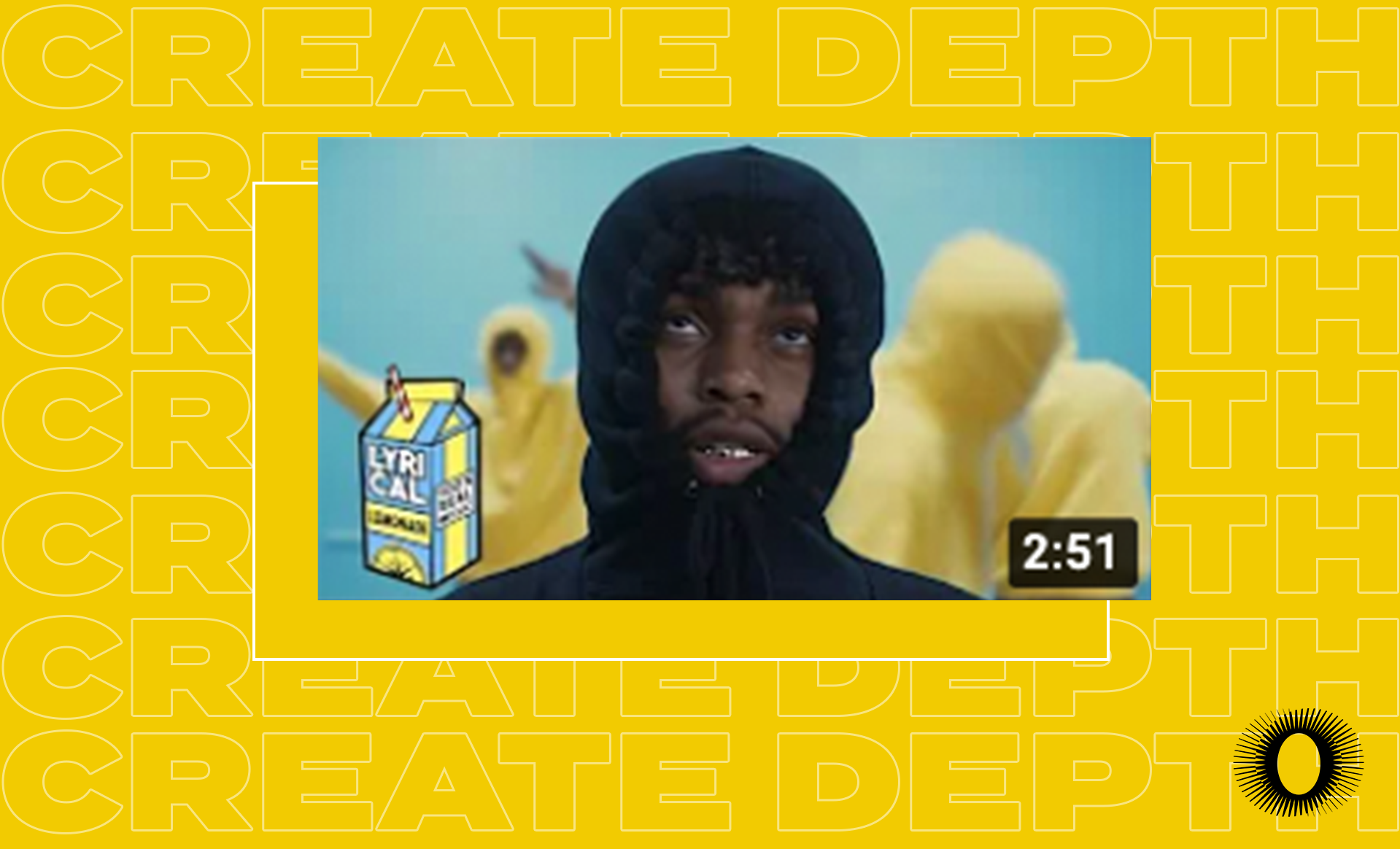
5. Create Depth Using Borders
Using forced perspective can entice audiences to click-through. This is a technique which employs optical illusion to make an object appear farther away, closer, larger or smaller than it actually is.
Try to apply these five YouTube thumbnail practices when sharing new videos with your fans. These aesthetic strategies can also apply to your social media accounts to create on-brand and appealing cover photos that draw in viewers and ultimately drive them to click-through to your content.